
Case study 03 / Provisions / Pacific Northwest
GourmetHarvest
A store selling things that are only available for three weeks. The catalog had to behave like a season, not a shelf.
gourmetharvest.co →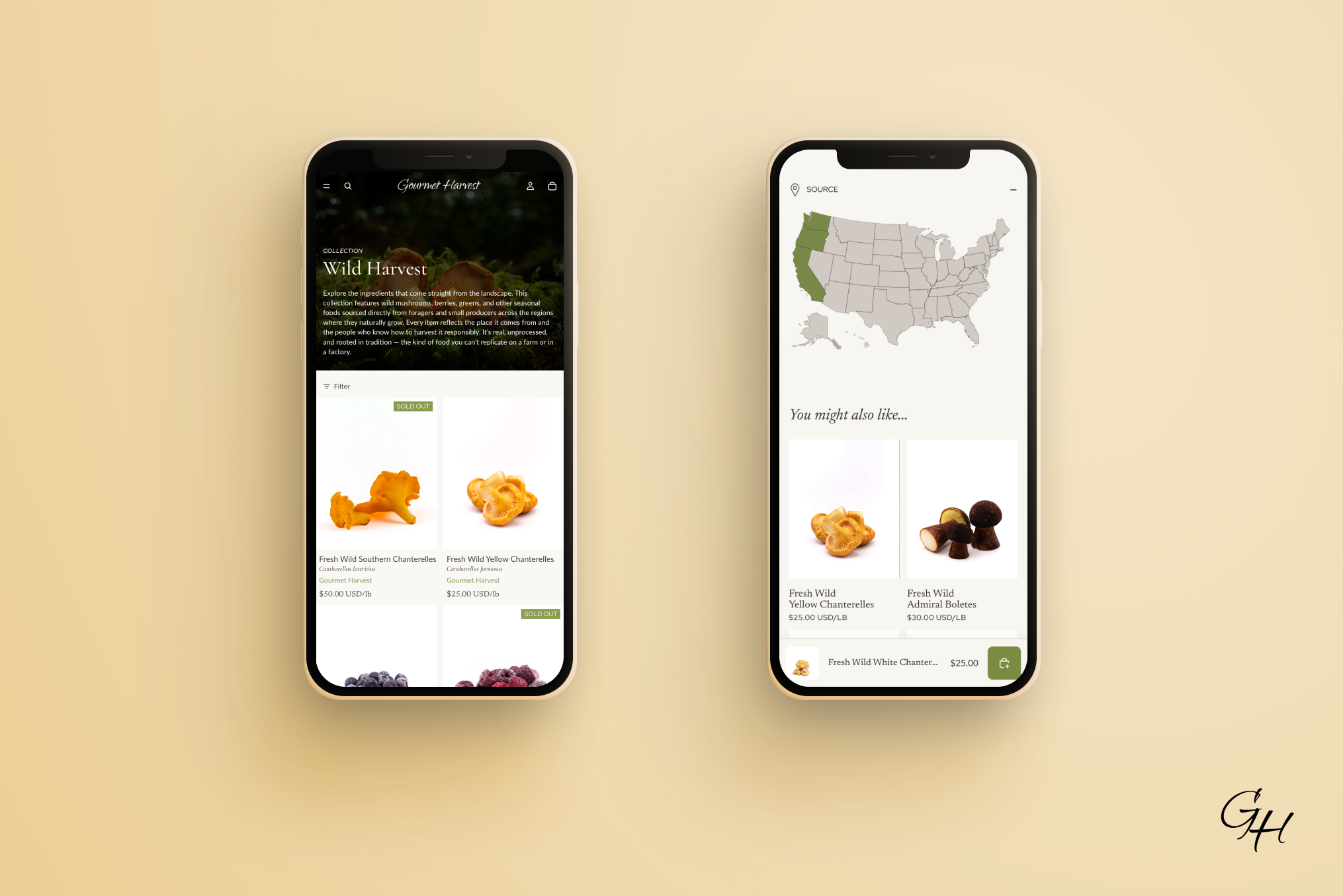
The brief
Foragers, fishermen and butchers in one store, without any of them reading like a supermarket aisle.
01
Sell the window, not the SKU. Ramps arrive with weeks, not months, and the page has to say so.
02
Give wild food, premium seafood and artisan meat their own worlds inside one checkout.
03
Keep the maker's name on the product, so a card credits a vendor rather than a brand.
Olive, cocoa,five rooms
Five color schemes, each a whole environment. Merchandisers pick a room, not a hex.
#F9F8F4
Bone, scheme 1
#8B9B57
Olive, every action
#A64D3A
Terracotta, hover only
#6C3B31 · #454F55 · #3E4539
Cocoa · slate · forest
#D9D4CF
Border, every scheme
Headings sit at #2B1B17 rather than black. Olive carries every button. Terracotta is hover only.
The Wild Harvest Collection
Cormorant · 500 italic · h2 at 40px
Cormorant italic for headings. It's the only place on the site where type leans.
Fresh and in season
Red Hat Display 500 caps · Newsreader 400 · Lato 400 at 14px
Four faces, four jobs: Cormorant announces, Newsreader names the product, Red Hat Display does every label and badge, Lato does the reading. Nothing borrows another's role.
Shot forthe season
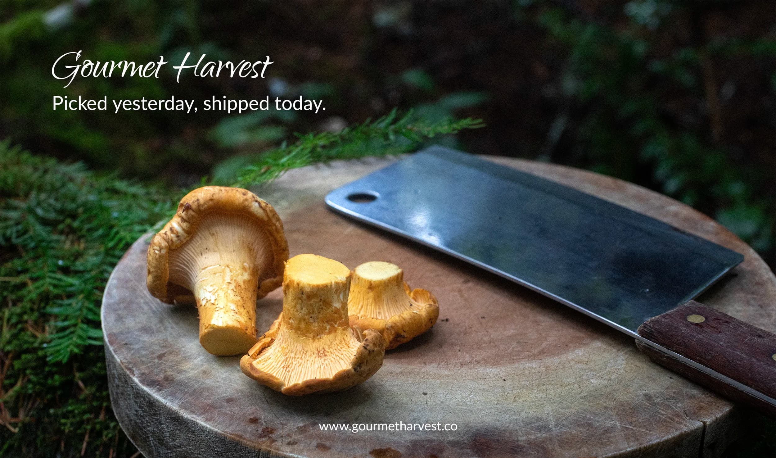
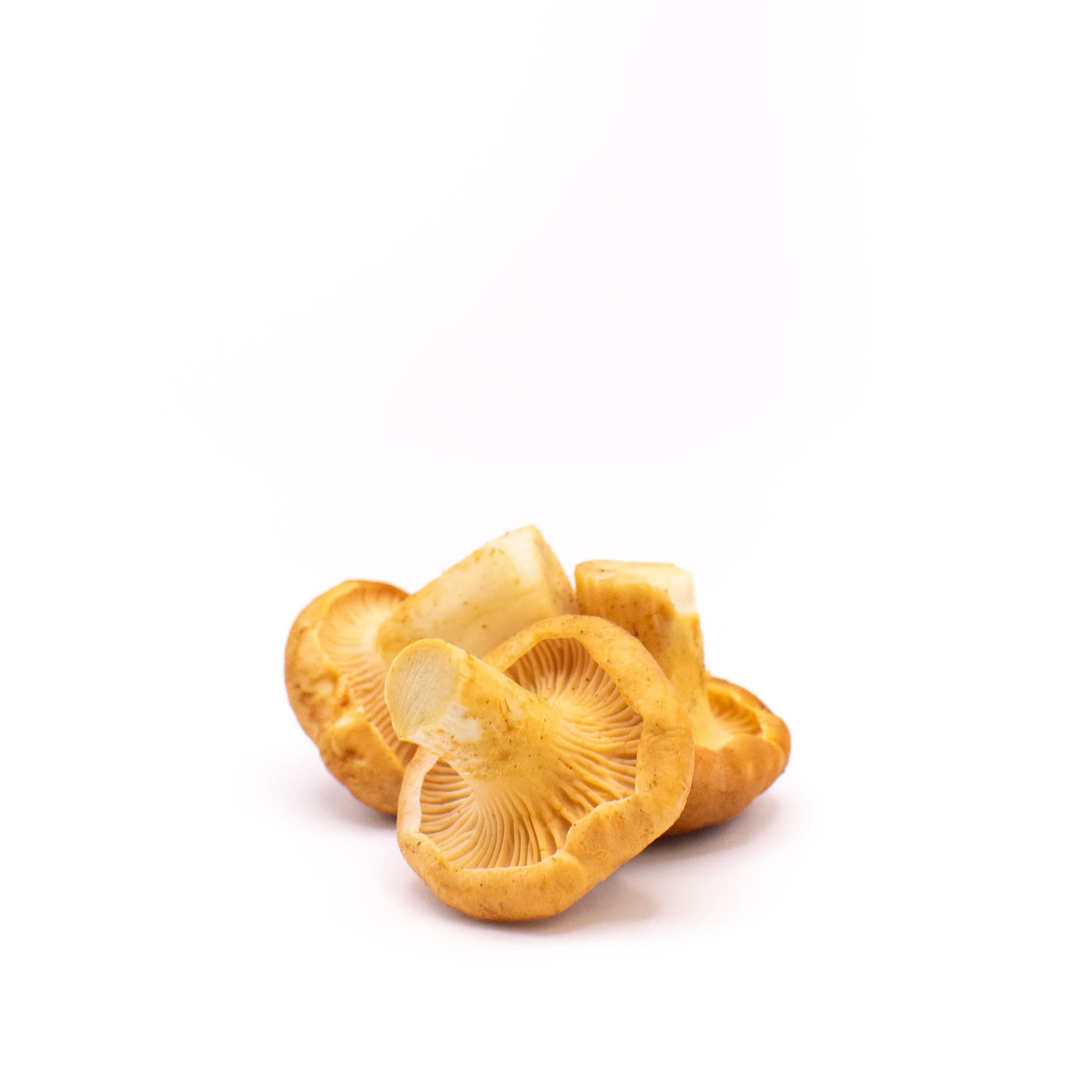
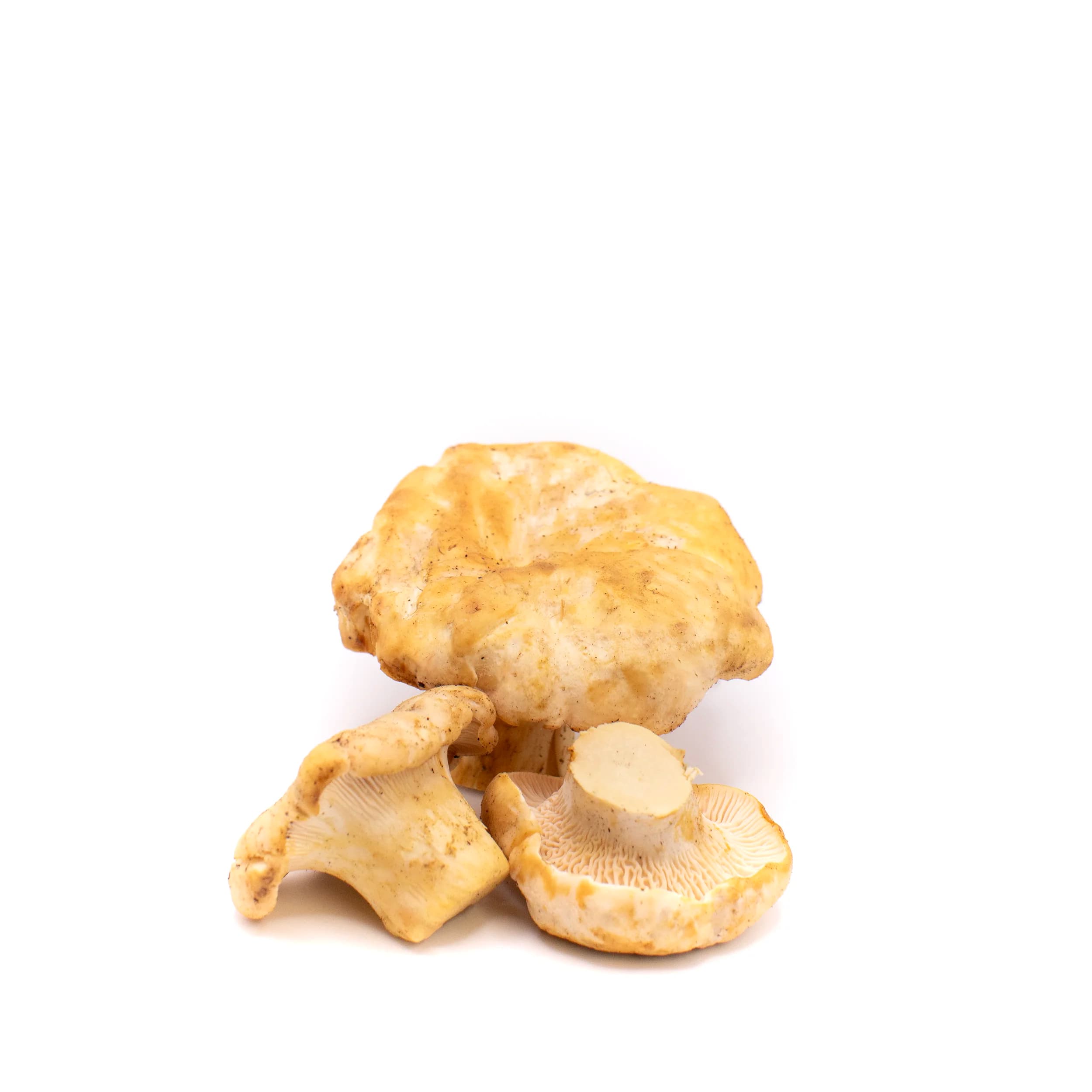
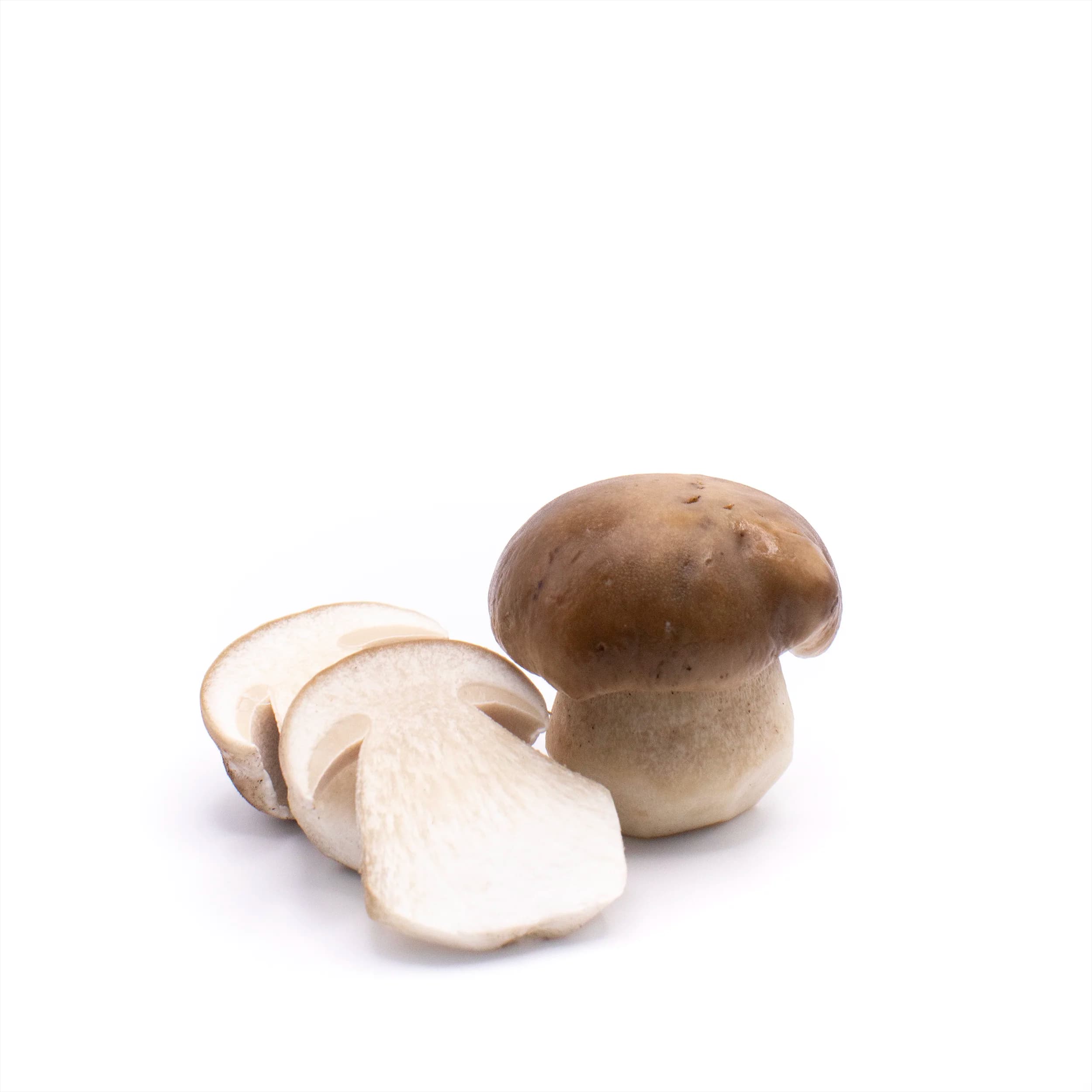
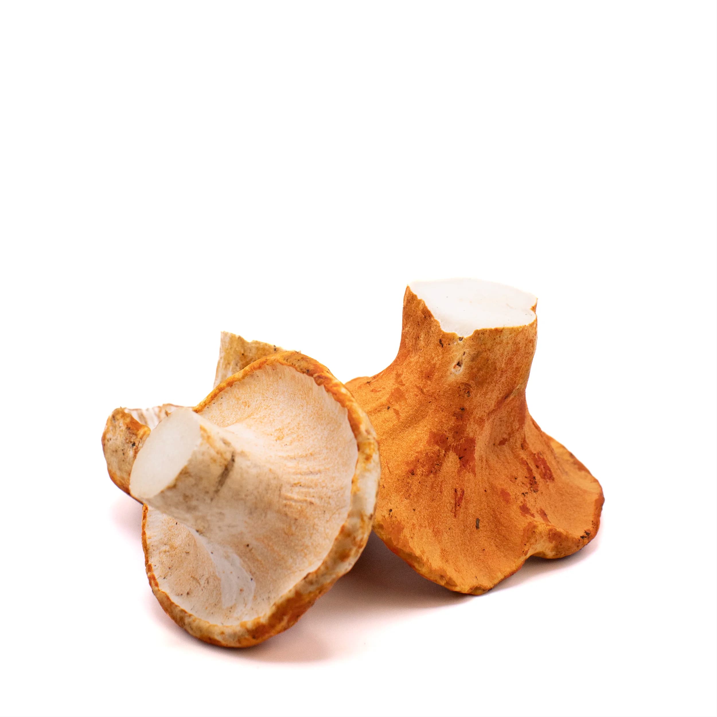
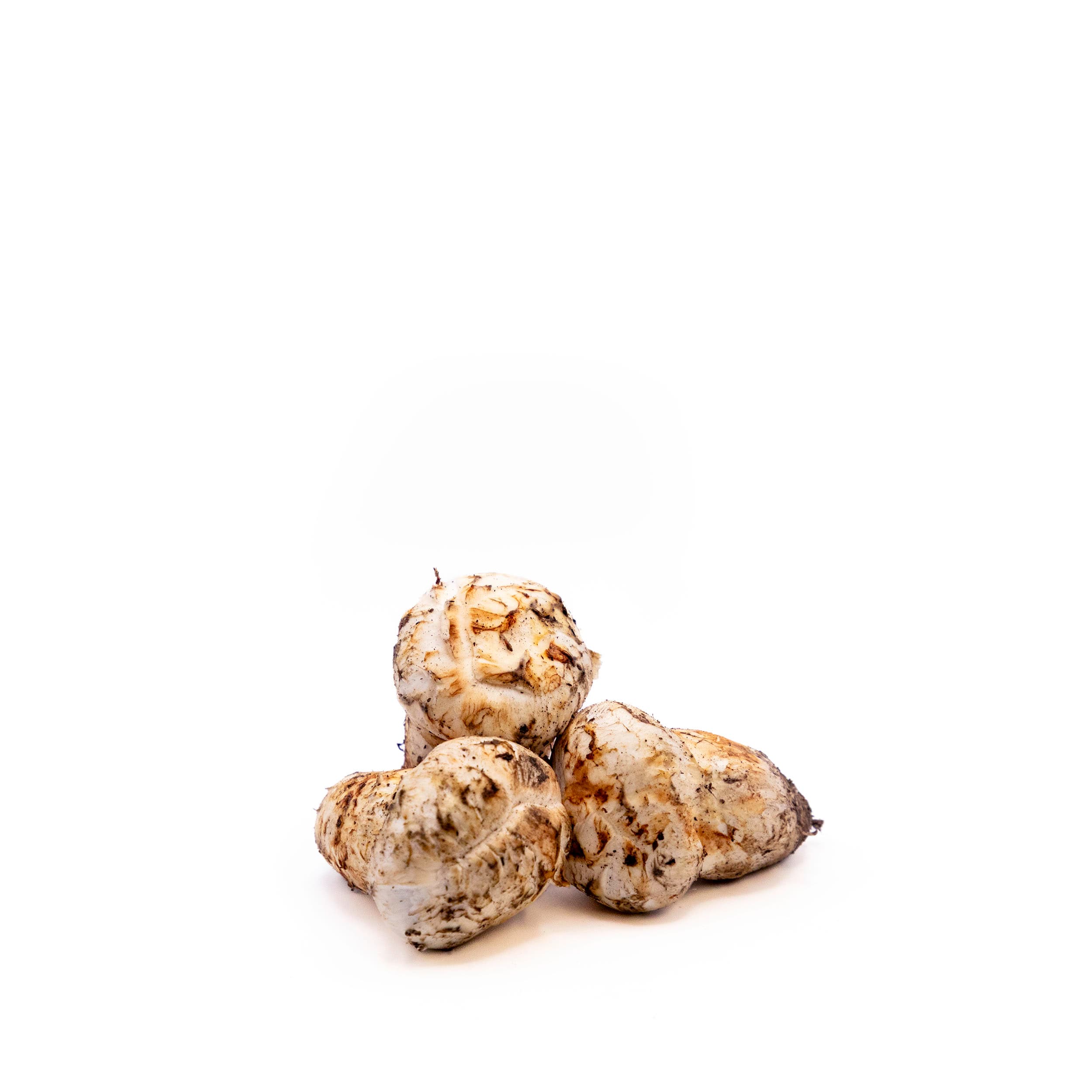
The photography is the catalog. Brand cover in the woods, then product stills that hold on a card and on a product page.
Four parts,whole store
A card, a button pair, a feature block, a bento tile. Assembled as Liquid blocks the client can re-order.
Gourmet Harvest
Fresh Wild Yellow Chanterelles
$25.00/lb
The vendor slot sits above the name, square badge pinned top-right, currency code shown on cards but not on product pages. The second photo swaps in on hover, so the card does the work a gallery would.
8px on buttons, 6px on inputs, 0px on badges and swatches. Three radii that tell you what a thing is before you read it. Olive fills the primary; the secondary is stone with an ink hairline.
Fresh and in season
Wild-Cultivated Ramps
Garlicky, grassy, and unmistakably wild. One of spring's shortest windows.
Shop rampsOne media-and-content block on a cocoa scheme, re-pointed at whatever is in season. It is the same block twice on the homepage. Once for the forage, once for the story.
 Wild food
 Seafood
 Artisan meat
Up to four collections at an 8px gap, one tile taller than the others. It replaces a nav dropdown on the homepage: three sourcing worlds, visible at once, no menu to open.
The store,assembled
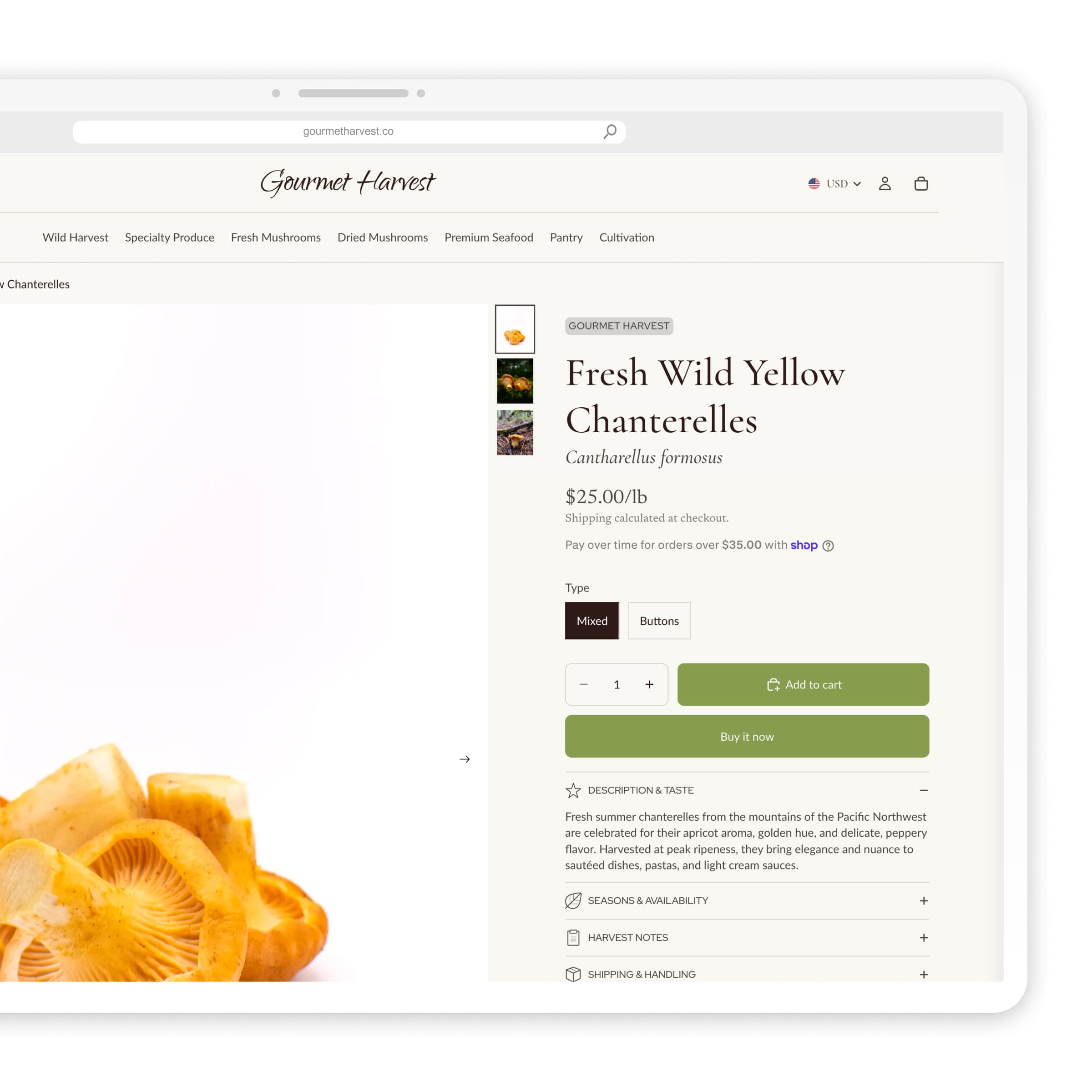
Product page as a customer sees it. Gallery, variants, and the season story in one pass.
Underthe hood
A Shopify theme the client merchandises themselves. Payments that keep up when inventory moves fast.
Platform
Shopify blocks and sections. Every homepage row is something they can reorder.
Theme
Five color schemes, four type roles. New sections inherit the system.
Merch
Collection bento, seasonal product lists, feature blocks that turn with the window.
Pay
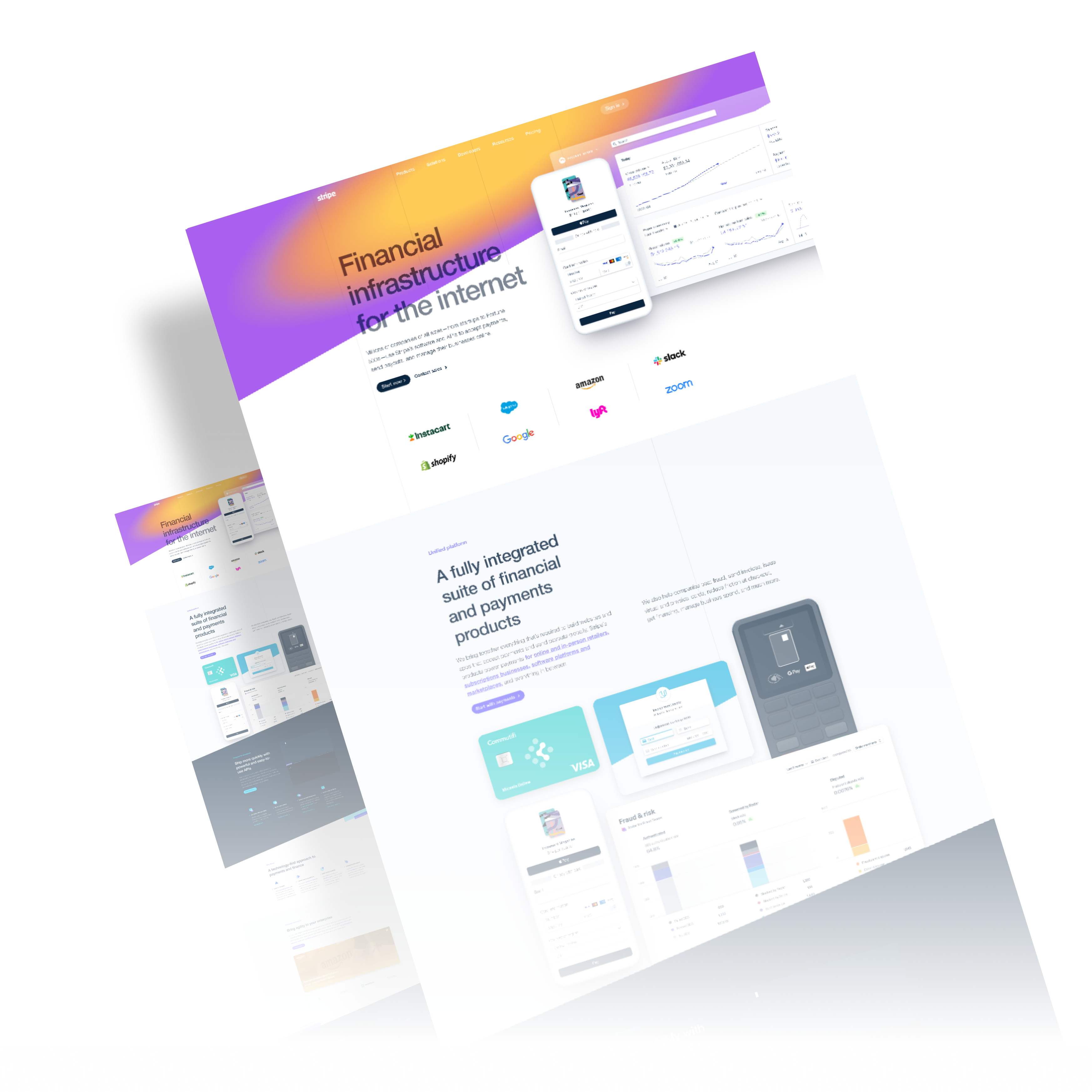
Stripe under the hood. Where almost all of the money clears.
$75k+
Revenue processed
+266%
Traffic, redesign + Shopping
+256%
Conversion rate, Shopify
Sell the season. A shelf can wait; a three-week window cannot.