
Case study 02 / Earthwork / Polk County, NC
TLJHauling
A one-truck outfit that needed to look like the crew it competes against, without pretending to be bigger than it is.
tljhaulingandgrading.com →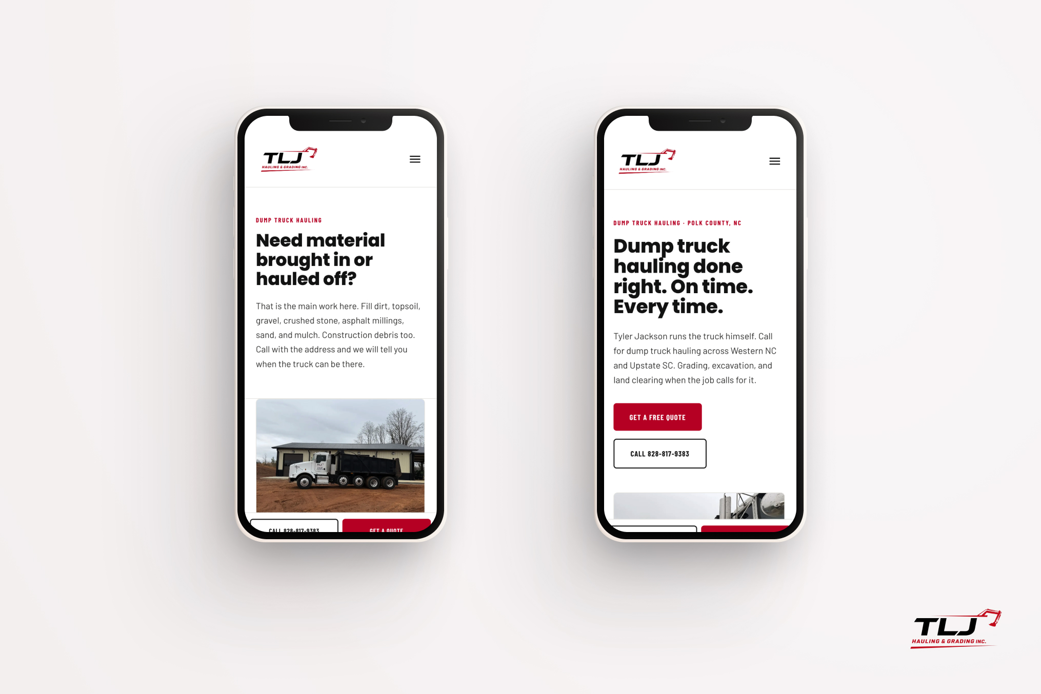
The brief
Tyler Jackson, owner on the job. The site had to earn a phone call from a stranger with a muddy lot.
01
Say what the work is in four words. Hauling, grading, clearing, driveways. Then show it.
02
Make the phone the primary interface. Most of this traffic is one-handed, standing in a field.
03
Rank across twelve towns in two states without a page of keyword mush for each one.
Red, ink,and red clay
One red off the truck door. Everything else gets out of the photography's way.
#C8102E
Red, the door
#8A1420
Red shade, hover
#161615
Ink
#A85A34 · #5B6470
Clay · Steel
#E7E6E3
Line · field · subtle
Clay and steel exist only because the job photos are red clay and machinery. They let a caption or an icon sit next to a photo without fighting it. The page itself is mist, not white, so scans of dusty equipment don't glare.
Site dirt work, done right.
Poppins · 600–700 · headlines only
Geometric and blunt. It appears at page tops and nowhere else, so a headline always reads as a headline.
Barlow Condensed 700 / .14em · Barlow 400 · 18px/1.55
Condensed caps do every eyebrow, label and button; regular Barlow does every sentence. Three faces, three jobs, no overlap.
Four parts,every page
A button, a card, a call bar, and one diagonal cut that does all the section changes.
Red for the quote, a 2px ink outline for the call, subtle gray for anything optional. Same 6px radius and 32px of horizontal padding throughout, so a row of them lines up without special cases.
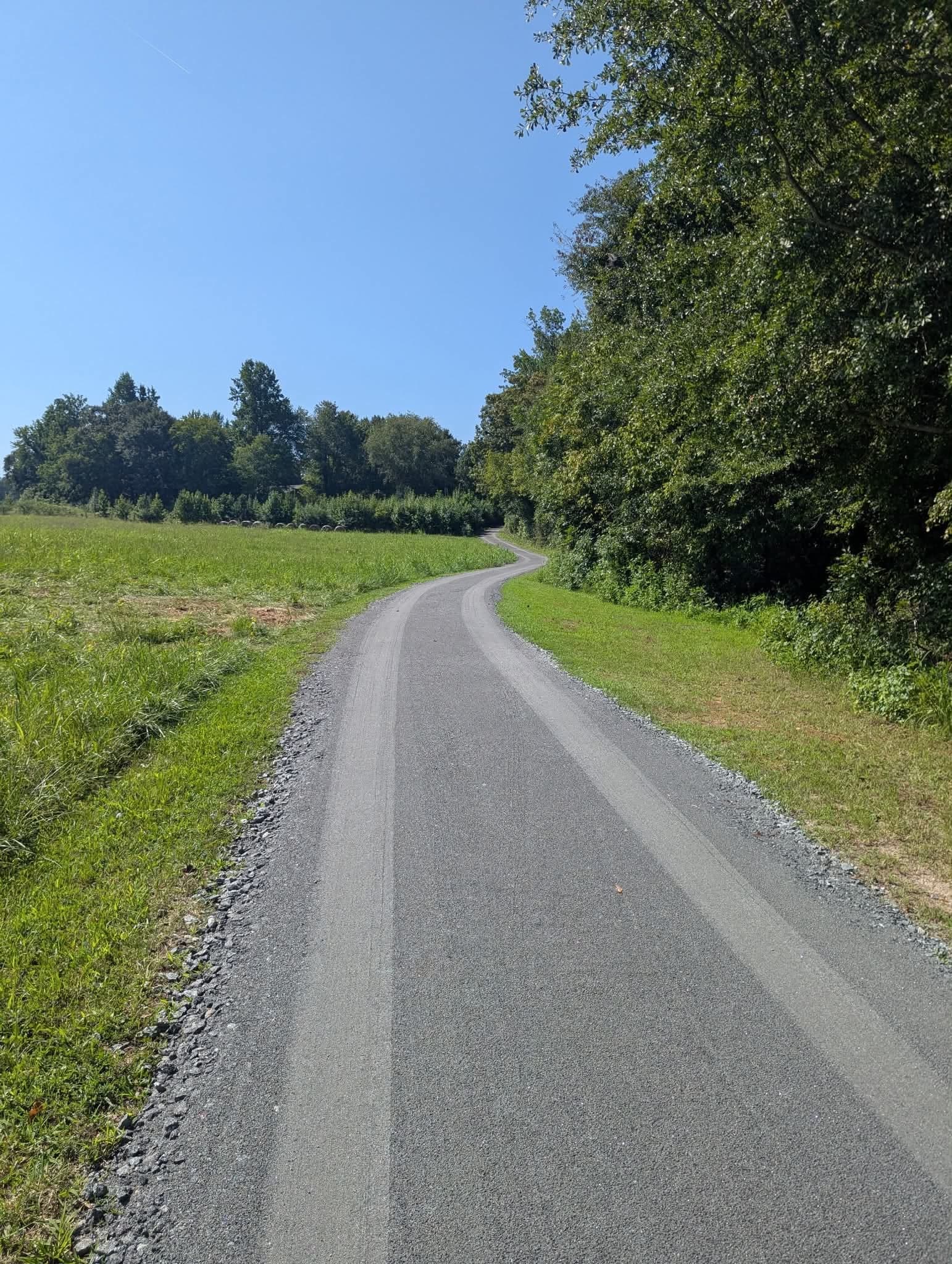
Driveways
Four of these carry the services offer. The 36×3px red rule replaces an icon.
Pinned to the bottom of every page under 768px and hidden above it. Two targets, both full-height thumb taps: the number that rings Tyler's phone, and the form.
Site dirt work, done right.
A red sliver clipped at 60%, then the ink block cut on the same angle. Two clip-paths, no images. It reads as a paint stripe on a truck and marks every switch from mist to ink.
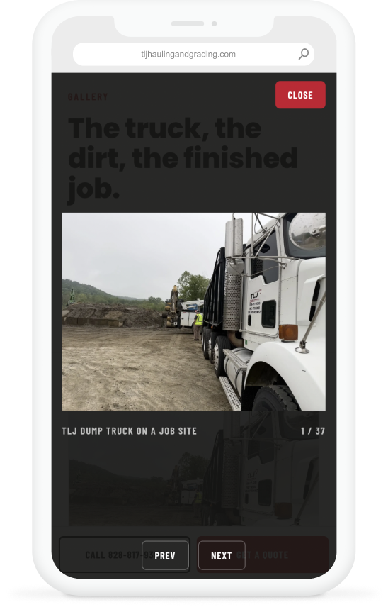
The truck,the dirt
Thirty-seven job photos, no stock. The gallery is the only place the full library shows up.
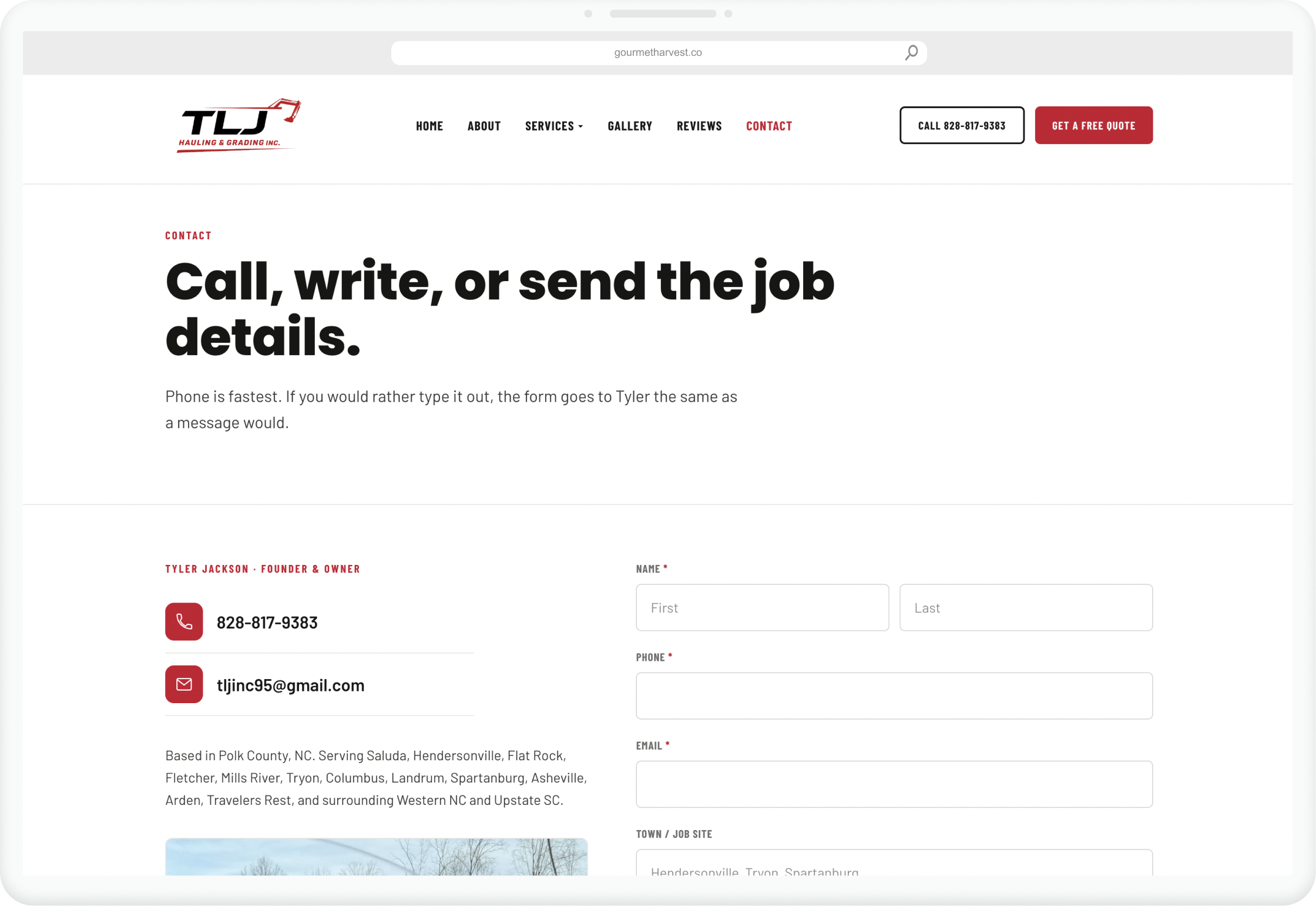
Phone first,form second
Call is fastest. The form still lands with Tyler, same as a message would.
Underthe hood
One content file is the whole site. Services, photos, towns and the copy Tyler wrote.
Framework
Next.js on Vercel. Six routes plus a page per service, all statically rendered.
Content
A single typed content file holds services, materials, service areas, the photo library and the About story in Tyler's own words.
Photography
Every page gets an exclusive set, so no shot repeats from home to services to contact. The gallery is the only place the full library appears.
Local SEO
LocalBusiness structured data, generated sitemap and robots, and the twelve towns named once in context rather than in a doorway page each.
Quote form
Posts to an API route and lands in his inbox. Underlined condensed labels, ink focus ring, no required field that isn't.
Reviews
A dedicated page rather than a rotating widget, so the words are in the HTML and Google can read them.
One truck, one owner. The site says exactly that and nothing more.